Visual Design
Design decisions: existing design
Native style
While we're not a natively-themed application, we do wish to fit within the operating system so that our app doesn't look out of place. This affects our choices of:
- interface icons (Vista makes frequent use of a certain back/forward icon style)
- color
- perceived depth, thickness
- border shape, width and styling
- font choice
- blurriness - Windows tends to be more bitmappy than OS X, preferring to align everything along pixel boundaries - see the Cleartype vs. Quartz wars.
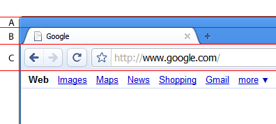
We use a non-native window frame with XP because the existing toolbar did not support our tabs-on-top design - its color and gradients did not support the overlay of interactive graphics, and it did not have the height we required. We use the native frame on Vista, and intend to use the native frame on OS X.
The Windows XP UI consists of three layers - the first two consist of a blue rubbery window frame, and a lighter tab frame. The buttons then stick out of this frame, forming a third layer of depth. Each of these layers should each feel no more than three or four pixels deep. We avoided going totally flat, as this clashed with the host operating system and felt wrong - Chromium should feel like a tactile object, not an abstract flat piece of software.
The Photoshop file used in the creation of the Chrome design can be found attached at the bottom of this page.
Mathemagics
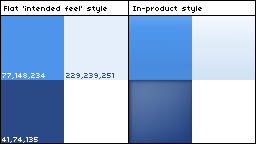
While the following is very rough because of gradual changes over time, rounding errors, and because highlights and shadows make it hard to judge perceptual distances, our design started based on the golden ratio. In the diagram above: C = GR * B B = GR * A As the titlebar fills up with tabs, 'A' becomes the only grabbable area for the window. This may prove to be too small for most users (user study results are encouraging, however), so this may change.
Type
For all Chromium dialogs and toolbars, we use the system default font, which is most frequently Tahoma 11px on Windows XP, or Segoe on Vista. We make the URL larger (13px) to make it stand out more, and because the omnibox is a large part of the product. This means that the baseline of the text in the omnibox doesn't line up with the baselines of the text for the menus. Cry.
Inspiration
While it doesn't show through today, we drew early inspiration from The Designers Republic's work on the then-Psygnosis games WipEout and WipEout 2097; the focus on blinding speed, and iconography that could be recognized instantly even in the depths of your peripheral vision were both key attributes we admired.
Visual tests
All designs should be tested against default desktop backgrounds on XP and Vista (with and without the default images), with multiple applications open (typically multiple Windows Explorer windows and Office), at different screen resolutions.
Resources