Window Frame
The frame is the area behind the tabs - this is the 'convenient grouping' area for our tabs. We wish to avoid including things within the frame (such as branding elements) to work away from making the frame feel like a container (ideally you'd think of it as 'goo that binds tabs together').
Window border
Our window border extends five pixels outwards around the left, right, and bottom edges of the content - three-pixel edges were too hard to grab. The border consists of a one-pixel tab border, three pixels of frame, and one pixel of dark frame border. This high-contrast edge ensures that the content (and the rest of our UI) doesn't bleed into other applications while allowing the content to feel like it is inside the tab. We have experimented with reducing this border size by one pixel, but the larger frame was more positively received.
Frame corners
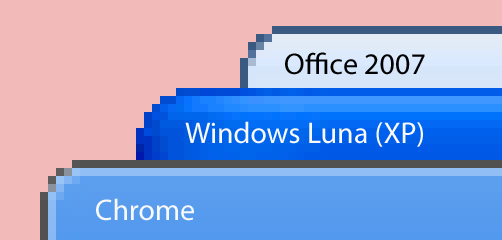
Like all Windows apps, we have aliased corners. We originally wanted a square frame, but this clashed with other XP desktop software. Instead we have corners that are tighter than the default and feel tighter still (compare the shape of the light-colored area in the Office 2007 frame with the medium-blue, non-highlighted area in the Google Chrome frame). We spent a long time playing with the lighter grey pixels on our window border to make sure they didn't blend in nasty ways on various backgrounds. While it's technically possible to get drop shadows on Windows windows, it comes at an unacceptable cost to performance and stability.